
Google: Introspect
Introspect is an internal tool that makes it easy to search and find information on
Google’s legal entities. The problem was creating a new one.
The Challenge
Google often needs to create a new legal entity. It’s a complex process that involves multiple teams who work together on everything from the initial request to operationalization of the new entity. The problem was that they had to do it with a spreadsheet.
Our goal was to build a workflow that would simplify the entire process.
The Approach
I joined the team shortly after testing on the prototype. So, I had to quickly get up to speed on the business processes and dig into the research.
Here’s what we heard from Googlers:
Introductory pages were too dense
Field labels were confusing
Lack of support content and context in forms
Prioritize feedback and generate ideas
After reviewing the research, I prioritized feedback and looked for opportunities where language could solve a pain point. There were plenty of things that could be done, like using progressive disclosure, making the forms more conversational, and getting labels, help content, and microcopy to work harder together.

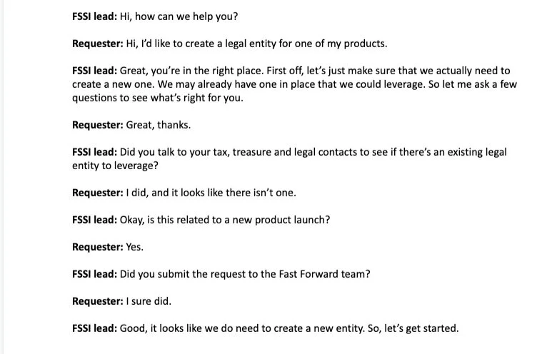
Write scripts
To help the forms flow more naturally and feel more conversational, I wrote scripts of what conversations might sound like between a user and different team members. In this case, I wrote an imaginary conversation between the requester and someone on the finance team. This is a great way to reveal the natural order of information, expose any gaps in knowledge, and create actual UI text with more natural language.
Sketch with words
To put content front and center in the design process, I initiated sketch sessions with words. This activity quickly generates ideas, shows a diversity of opinions on language, and makes sure there’s a strong rationale for the layout and content hierarchy.

My Role
Content strategy
Ideation
UX writing
home page
For the home page, I reduced the amount of content, providing just the information users need at this stage. I also added a benefit-oriented headline and an overview of the app. Finally, I created a stronger hierarchy that brings a sharper focus to the two primary actions for users: requesting an entity and getting access.
Before
After
empty state
For first-time users, we wanted to give a quick overview of the process and what’s needed to get started. But the initial mocks again provided too much info, too soon. I reorganized the content to give users only the info they need, when they need it.
Before
After
intake form
I restructured the existing intake to feel more like a conversation, grouped info into a logical flow and categories, and added content that enabled users to answer the questions with greater confidence.
Before
After
new entity tracker
For all users, we created a view of their tasks and projects. I added explanatory copy, helped to simplify the page structure, renamed column headers, and created clearer calls-to-action for assigned tasks.
Before
After
What users are saying so far
Introspect recently won FinWorks Best UX Award at Google (the Finney). More importantly, it’s making our user’s days a little better.
“This is the fastest entity incorporation I've seen. Great work! From initiation to incorporation, it took just 16 days!” 😎
- Introspect user